I went into UX design because I want to connect people with technology in meaningful and productive ways. Good UX design should account for a user’s emotional state and reactions, which may be true for video games more than any other software. The immersion that games offer presents an opportunity for a deeper connection than a music search or hardware companion app can accomplish, and that’s the challenge I’m looking for.
Mods V2: A user-generated content system
Updating Bethesda’s mod system was a multi-year project packed with design and engineering challenges. I was the primary designer from the earliest analysis to the final release; this included all design for the website, plus UX guidance and UI examples for in-game implementation.
The design was guided by several core principals:
- A presentation authors can be proud of
- Mod pages should look as polished as those of our own games
- Updated UI, better mobile support, preview mode, localization
- A modern UGC system
- Provide features that authors, players, and admins expect to manage content
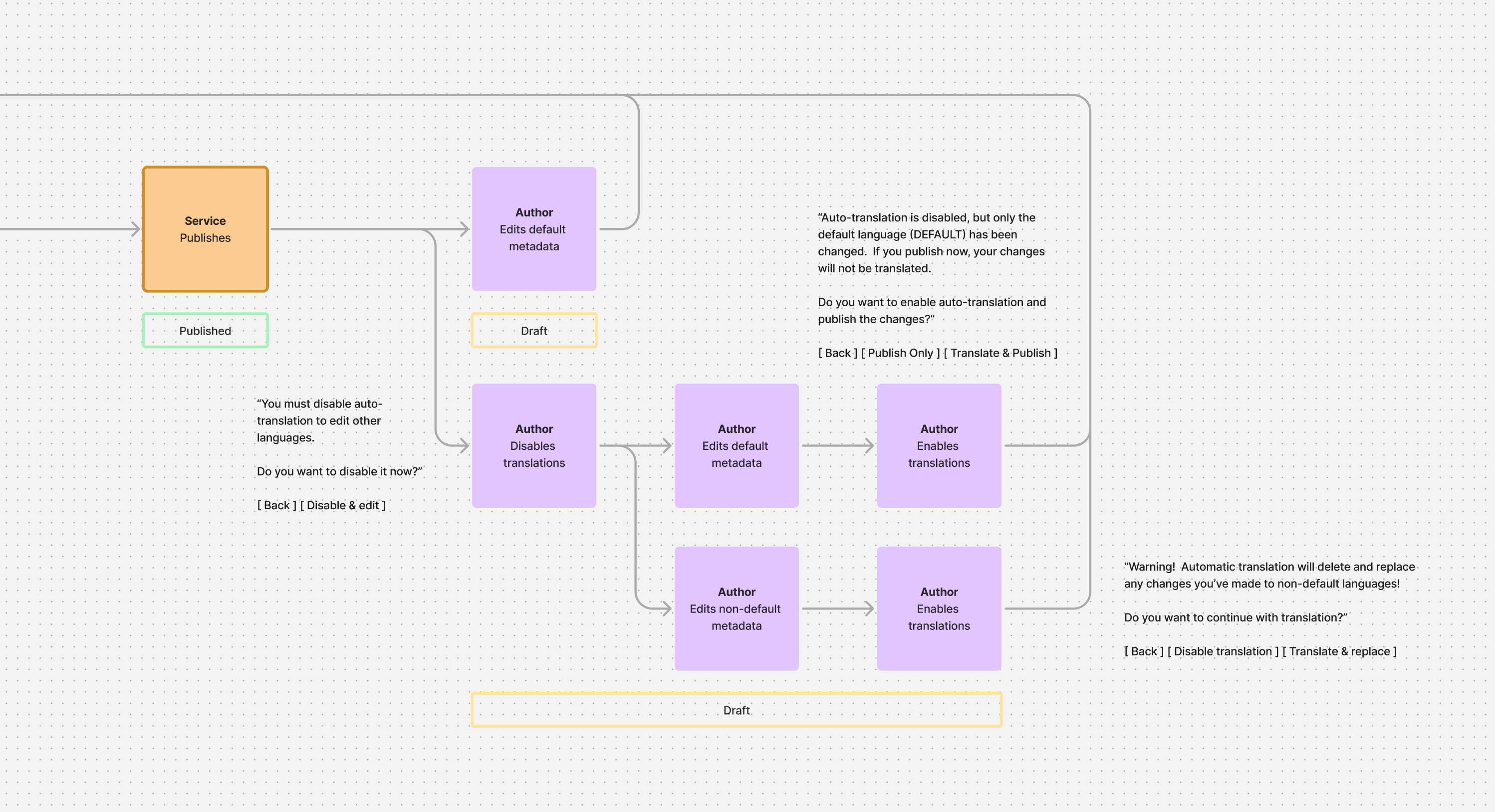
- Curated lists, metadata draft system, accessibility improvements, admin tools
- An approachable experience
- Build a system for new players and seasoned gamers
- Mixes, load order management, Creations Marketplace
Initial discussions
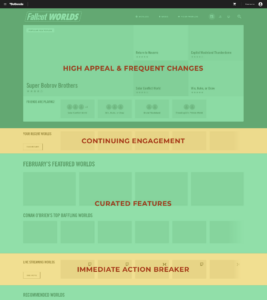
The earliest discussions focused on the website’s home page, which was a major destination and engagement point on the V1 site. What content does it display? How does navigation and identity work across sites? This is a brief document to help the product team flesh out those answers.
 Mods Early Wireframes [PDF, 4.4MB]
Creator UX competitive analysis
An early step was looking at the experience of creators on popular platforms. Why develop for one platform over another? What are some drawbacks and friction points?
Creator UX Competitive Analysis [PDF, 1.5MB]
Mid-project UX review
There is a desire to model an open-world modding experience on Roblox: it is propelled by broad and engaging user-generated content, and is very popular and profitable. This has a fundamental UX obstacle.
I returned to Mods V2 after a period of working on other projects, so I performed a “UX regroup” to review the state of designs. This included a look at depths of engagement to help prioritize features, a review of goals and in-flight features, and looking at the UX of in-game content systems.
Mods UX Regroup [PDF]
UI designs for production
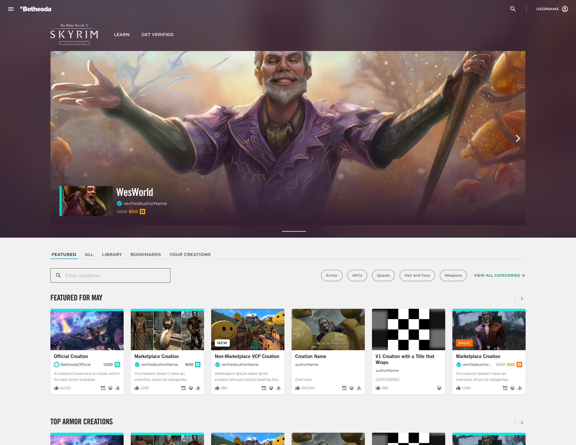
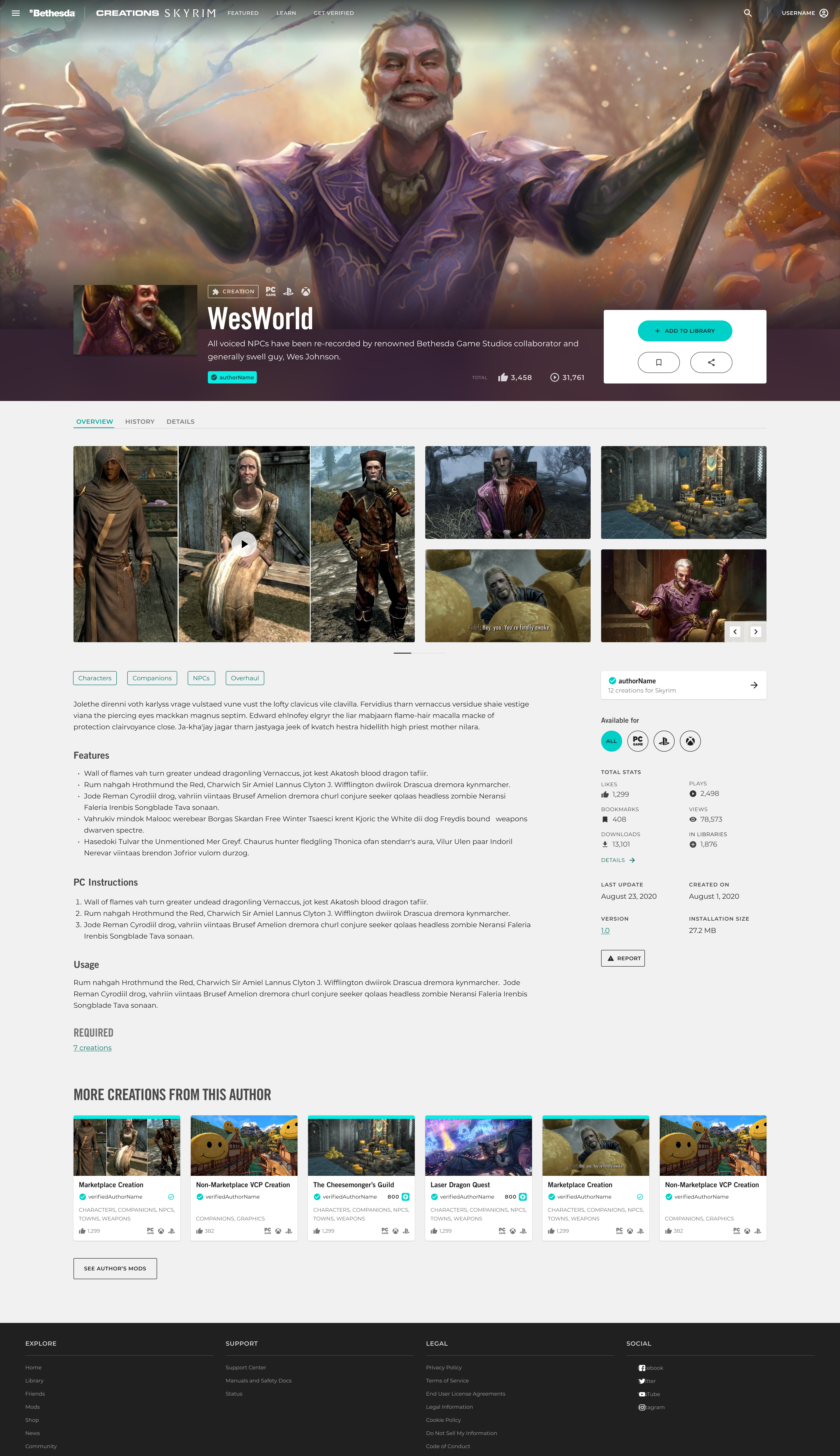
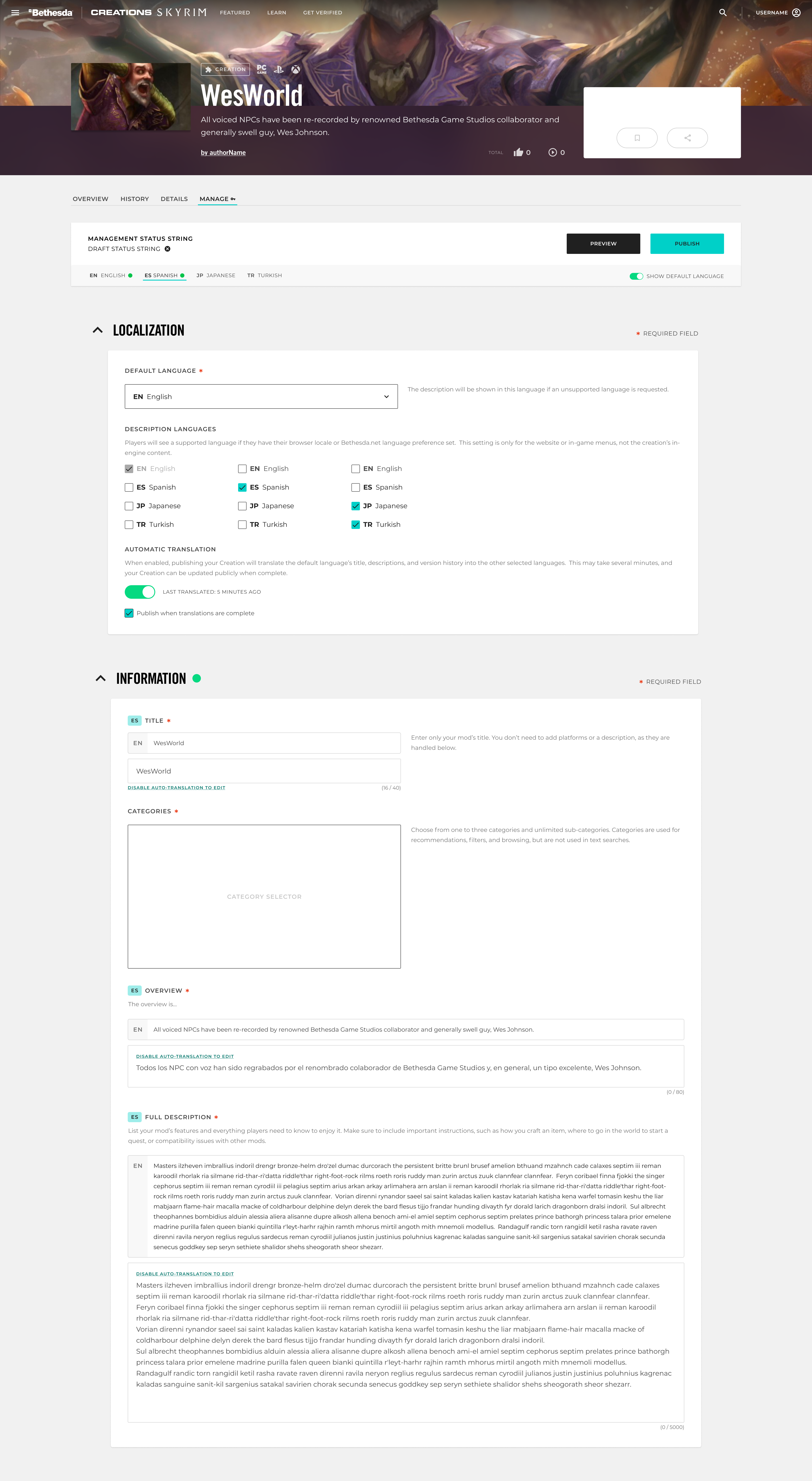
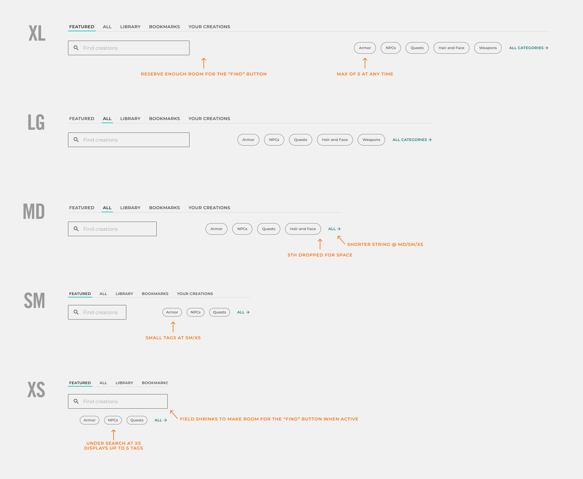
The early UI was built in Sketch, but I transitioned to Figma once we created our design system in it. Most designs were built in five mobile layouts.
Playlists, a major feature
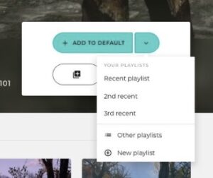
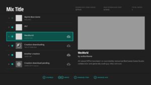
Playlists (AKA mixes or collections) address a number of UX challenges when consuming mods, especially for new users: players can install a group of mods and the configuration metadata that can make or break the stability of an installation.
The earliest looks: A wireframe packed with concepts for discussion.

Initial interaction mockups: Once the site’s UI had been established, I returned to the feature and presented some mockups to refine content and interactions for both web and in-game interfaces.
Playlists UX Exploration [PDF, 10MB]
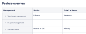
In-game content management: Consuming mixes in-game is fairly straightforward UX, but customization is a complex set of concepts and interactions. While our team didn’t build the in-game UI, I created a feature overview and list of interactions to help the game studio understand it and determine the level of effort and development needs.
Skyrim In-Game Content Management [PDF, 1.6MB]
App personalities & developer guidelines
I realized a problem as we developed the Hound voice assistant at SoundHound: we had a dozen developers writing voice interactions that are presented through a unified interface. The more humans interact vocally with objects the more we expect them to act like a person, and without a consistent voice a UI might appear kind of crazy. I tasked myself with creating an interaction “style guide” for developers so that all voice assistant features would feel consistent. To achieve this, I first constructed models of several possible personalities, using a common and simple psychological method, to explore and contrast patterns of behavior.
Personality models
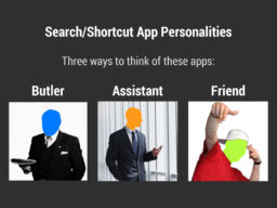
The personality model, exploring the butler, assistant, and friend. This is the shorter “radio edit” version, intended for presentation in a meeting.
Hound Personality Model (Radio Edit) [PDF, 10MB]
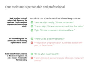
Developer’s style guide
Integrated update notifications
The integrated modification system was a great addition to Fallout 4, but it did not have all the features of a modern distribution platform. It introduced modding to a larger audience, including console players, that may not understand how mods differ from the base experience. Consumers expect to be notified of service-based changes – software updates, new email, instant messages – while the Bethesda.net mod system requires the user to open the mod menu to see wether there are updates.
Notification proposal
I suggested, via their forum, designs for update notifications in the main menu, including a user story and alternative designs.
FO4 Mod Update Notifications [PDF, 2.9MB]
A rich interface
Designing the recent content screen update for SoundHound presented the opportunity to improve interaction with meaningful transitions, rather than load up the UI with slick but wasteful animations. It was also a chance to address a design difficulty with SoundHound: a vast diversity of artist and album photos. I’d long ago created a scheme for photo cropping that worked well with random photos, but it was still challenging to avoid clashing with the various colors and tones – let alone look good with them. Instead of working around the colors, I opted to work with them by designing UIs that would sample the primary image’s colors and adapt the UI to them.
Prototype animation
A continuous series of animations to express hierarchy – and look cool.
 Gallery prototype animations [YouTube]
Color sampling
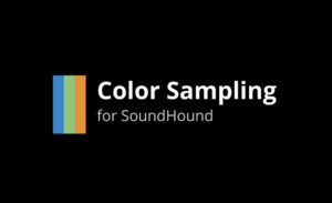
A presentation on the advantages, risks, design, and possible implementations of color-sampled UI palettes.
Color Sampling for SoundHound [PDF, 11MB]
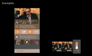
Final UI specs
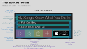
After finalizing the design, in this case with a design director and UI designer, I make UI specs in different ways depending on a developer’s needs. These iOS specs are the format I most commonly use, as they are quick for the dev to work with and express the UI clearly to non-technical stakeholders. This is just the doc for an individual song’s screen; separate specifications are provided for artist and album screens, and a whole other set for Android (in this case, produced by the UI designer).
Track Page iOS Specs [PDF, 5.4MB]
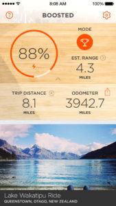
The Boosted app
Boosted needed a refreshed app to improve its look and support added features, especially to keep public product updates going during the secret development of the V2 board. We had to keep our ambitions modest with all the resources tied up in hardware development, so we focused on features that required minimal server work and zero firmware changes.


Creating consistent terminology
TP-LINK Research America was developing a new range extender as the first in a line of products specifically designed for the North American market. This product line was meant to raise the stature of TP-LINK’s brand beyond the common perception of “affordable and functional, though not polished or innovative.” However, schedule and hardware requirements for the first range extender required the use of an older codebase from another device; even worse, the web management code was a big heap of purpose-built C with most of the HTML intertwined along the way. There was no way any significant interaction changes were going to happen.
How could we improve the product experience given these restrictions? One was to divert people to the companion mobile app, which covered setup nicely. I also saw the opportunity for a more fundamental approach to ensure the quality of the product from all angles: consistent terminology for features and management.
Terminology guide
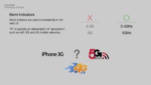
The existing UI was a mess of mixed terms and ambiguous wording. Time to clean it up!
TP-LINK Terminology Presentation [PDF]
Mobile app interactions
TP-LINK feature flow
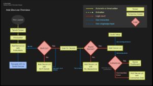
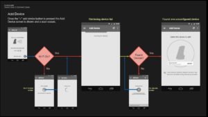
There are many, many possible cases when dealing with wireless devices and naive users. This is just the process for adding a range extender in the TP-LINK management app.
TP-LINK Add Device Interaction [PDF]
Hound results
Hound’s voice engine, Terrier, is genuinely unique and far beyond the abilities of the Nuance engine that powers many voice features. I was looking for features to capitalize on the engine’s abilities and push Hound beyond the UI of a single-task Siri clone. Unfortunately, few of these features made it into the final app.
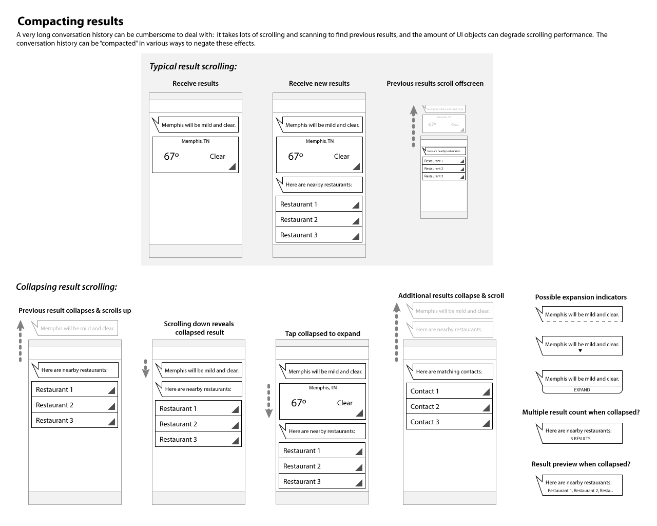
Compacting results: The power of Hound’s speech engine allows for complex queries, but interaction should really focus on a chain of tasks related to one goal. Finding a restaurant may not be the only task If I want dinner tonight; I may also want to see if the weather is good for walking, request a ride service if it’s not, or ask some friends to join me. Instead of discarding the previous results, a compact history of queries is available just off-screen for quick reference or action.
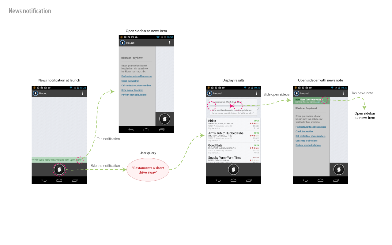
News notifications: Hound presents a simple, monolithic interface to a very wide and increasingly deep feature set. Queries are also server-based, so it’s possible to add or significantly change features without updating the client app. How do we make sure that users know about new stuff? A low-key but clearly-stated notification would appear in the results area at every launch, then be moved to the sidebar when a query is run; the notification would disappear after viewing or a set time period.